Aurevanes — Brand guidelines (France)
A concise design system for consistent brand expression across logo, colour, type, imagery and UI components in Paris and throughout France.
Overview
These guidelines provide practical rules and resources to keep Aurevanes' visual language coherent across print, packaging, web and digital products. Use the palette, type scales and component patterns herein as a baseline. For production-ready files, request the archive via our contacts page.
Core promise
Thoughtful craft, strategic clarity, and Parisian refinement — applied across every visual touchpoint.
Color system
Primary and supporting colours with usage guidance and accessible contrast targets for French-market interfaces and print.
| Token | Hex | Usage |
|---|---|---|
| Brand Magenta | #ff00ff | Primary accents, CTAs |
| Brand Cyan | #00ffff | Highlights, gradients |
| Dark | #0b0d10 | Backgrounds, text |
| White | #ffffff | Surfaces, backgrounds |
Use gradients for hero and CTA treatments; prefer solid fills for print. Check AA contrast for text over backgrounds.
Typography
Primary: Inter (variable) for UI and digital. Secondary: Playfair Display for editorial headlines. Maintain consistent scale and weights across components.
- Heading scale: H1 48/56, H2 32/40, H3 20/28
- Body: 16/24 regular; Small: 14/20
- Web: Use system fallbacks if webfonts not available. Use font-display:swap.
Aa
Inter / Playfair Display — examples above show relative sizes for print and web.
Logo usage & clearspace
Respect clearspace and minimum sizes. Use approved variants: full-colour, single-colour reversed, and monochrome for engraving.
Minimum width for print: 24 mm. Digital minimum: 40 px. Clearspace equals the height of the logo mark (X) on all sides.
- Do use approved colors and spacing.
- Don't stretch, rotate, or add drop shadows.
- Don't change letter-spacing or replace type.
Deliverables include SVG, PDF (vector), PNG 300/72 dpi, and EPS for production. Request brand kit via Contacts.
Imagery & photography
Photography should feel editorial, natural light, and slightly desaturated with a cool tint. Use human-led scenes when possible to reinforce craft and context.
Crop for focus and maintain consistent color grading across campaigns.
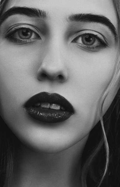
Preferred portrait style
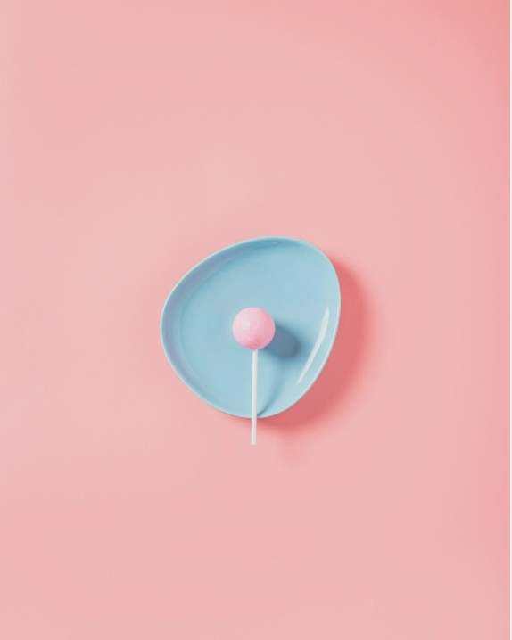

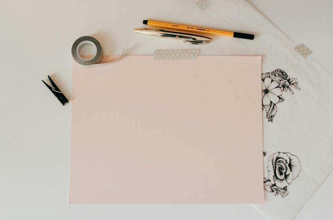
Components & UI patterns
Buttons, forms, cards and navigation follow a reduced palette and clear hierarchy. Primary actions use the brand gradient; secondary actions are outlined or neutral.
Downloads & resources
Need logos, color tokens or UI kits? Request the official brand package and production specs via our Contacts page. For legal and usage terms, consult Legal.